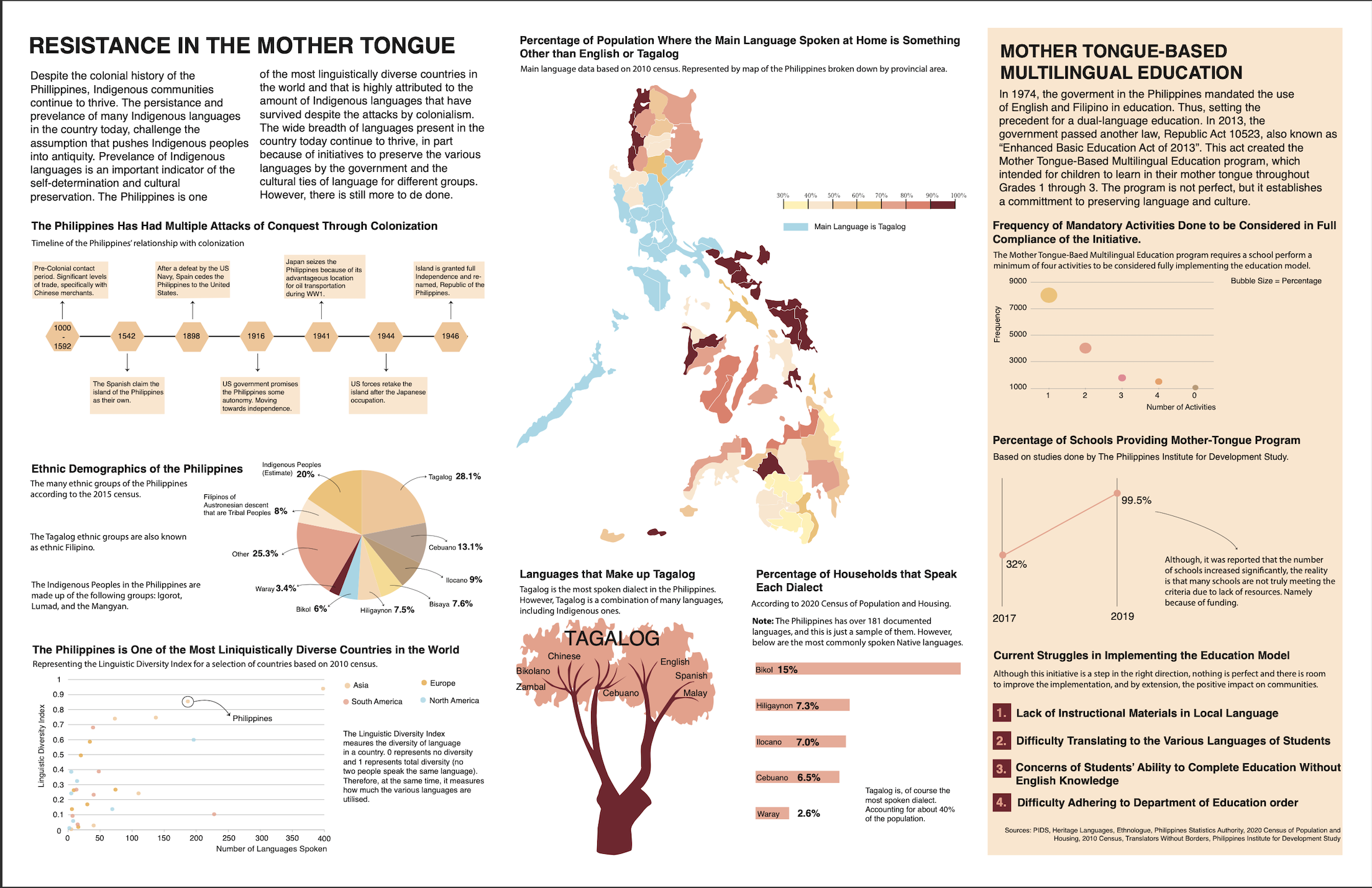
Resistance in the Mother Tongue
Winner: Best Undergrad Data Visualization Project at University of Miami Interactive Media Showcase, Spring 2023
Timeline
April 2023 - May 2023
Role
Research, Visual Design, Data Cleaning
Tools
Adobe Ilustrator, Flourish, Microsoft Excel, Miro
Introduction
This project was completed as a Final Project for a Data Visualization course taught at the University of Miami in the Spring 2023 semester. This was my first time doing data visualization and I ended up loving it and the process of creating these narratives. I found it to be a great practice of blending my UX/UI design skills for a 2D poster. We had no constraints, so I built a brief for myself.
The Goal
Create a data visualization project that explores the presence of Indigenous communities despite and in spite of colonization through the lens of linguistics.
Problem
The narratives and precense of Indigenous peoples are often overlooked.
Invisibility is a significant issue that follows Native and Indigenous peoples. This invisibility leads to other negative outcomes such as the attitudes of mainstream society of pushing Indigenous people into antiquity and overlooking problems that impact these communities. This data visualization was created for a Final Project for a Data Visualization course at the University of Miami. For this project we were given minimal constraints and could craft any narrative that we wanted.
Research
Part 1: Finding Inspiration in Music
As I was building my brief for myself, I knew I wanted to focus on language and Indigenous communities, but I knew I needed to pick a specific context. Recently, I’ve been listing to a lot of Filipino music in Tagalog, which got me interested in other languages in the Philippines as well as Indigenous communities there. What I then sought out to find, was what could be the story about language and indigeneity in this context.


Album covers for two of the artists I was inspired by. Letters Never Sent by Arthur Nery (left) and Episode by Zack Tabuldo (right)
Part 2: Discovery & Parameters
I started by giving myself some parameters for design and research. At this stage I was asking questions in order to construct a narrative and brainstorming where I could begin to look for data.
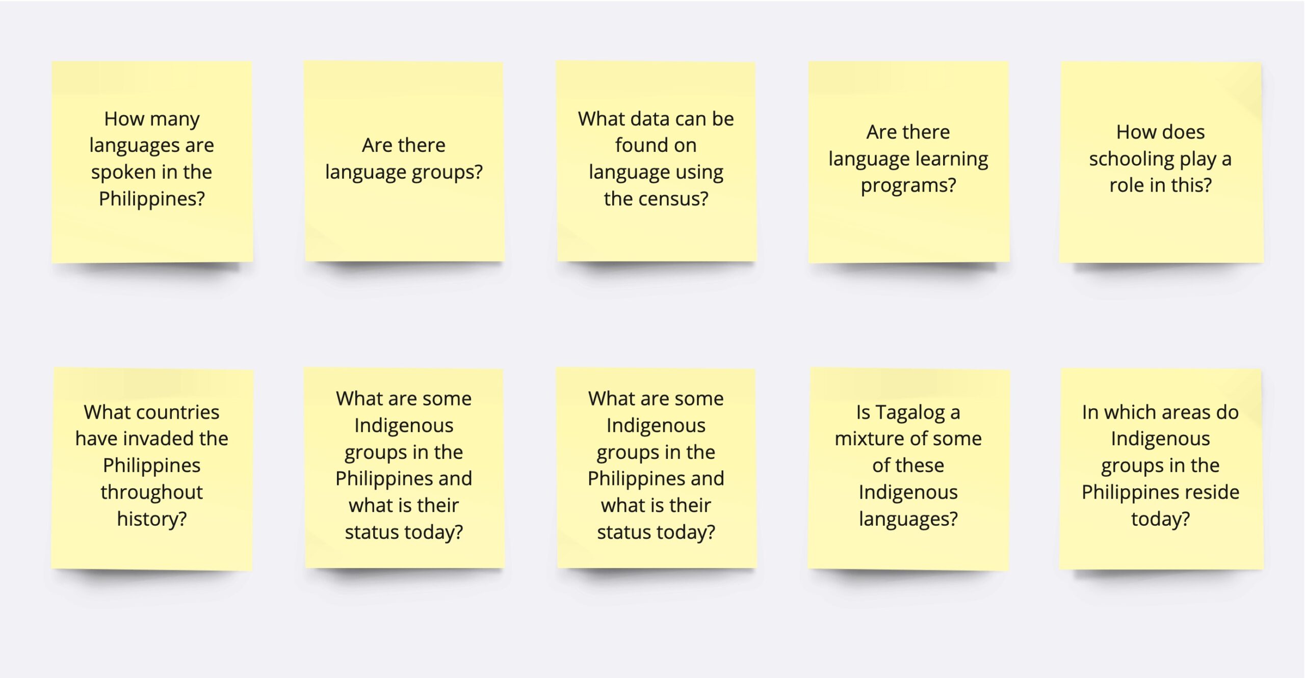
Some questions I had as I started this project
Part 3: Utilizing Philippines Census Data and other governmental data proved the most useful for this project.
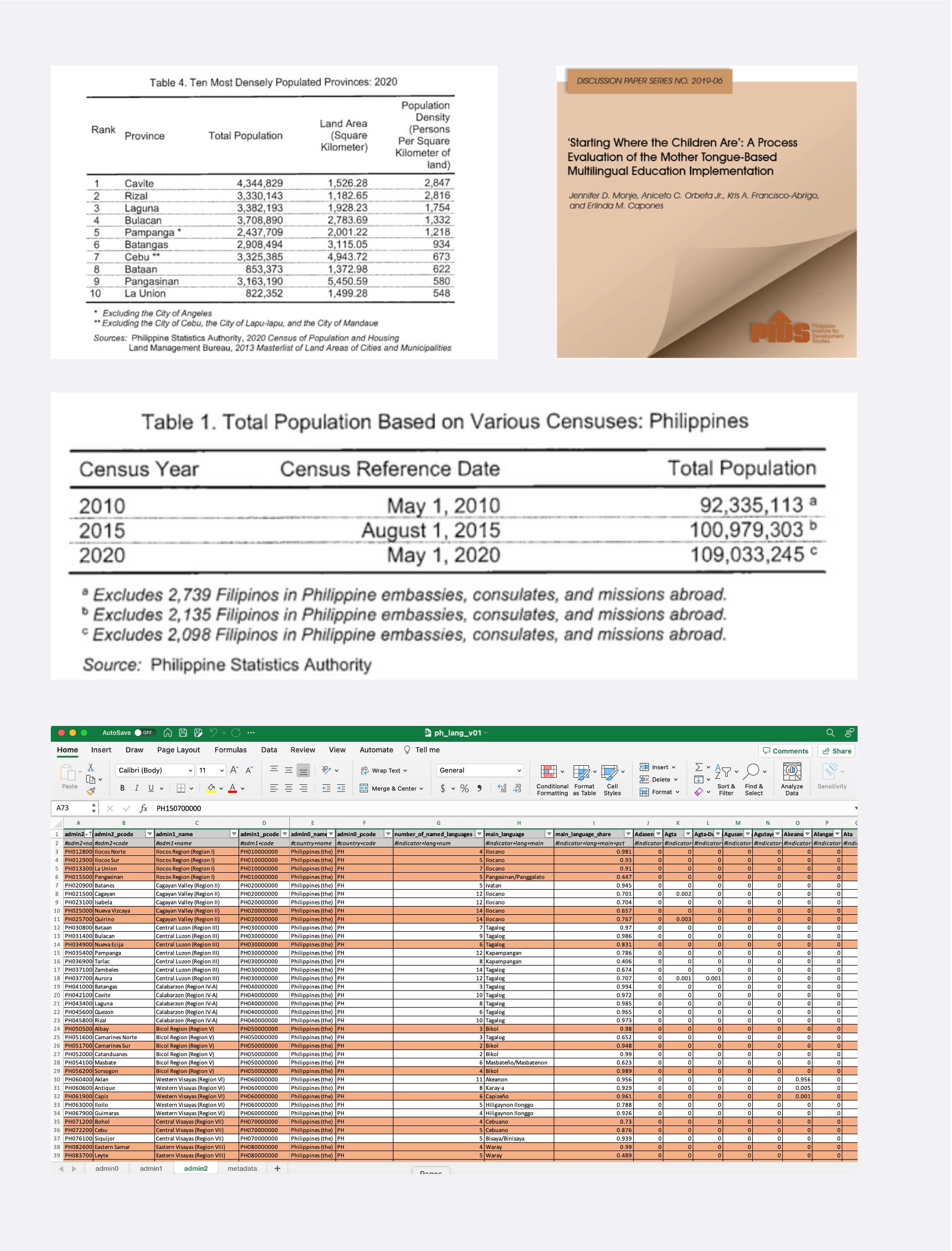
To ensure that I was using reliable data, I sought out official data from the Philippines government. Most of the data I used in terms of number of households that speak each dialect, main language spoken at home, demographics, and most densely populated areas, all came from the Philippines' government sites. Some other sites that were used for data came from NGO organizations that focused their work in the Philippines and Philippines Institute for Development Studies (PIDS). I completed some calculations myself in order to find averages and percentages with the data/numbers provided.
Screenshots from Philippines Census Data (2020), Philippines Statistics Authority, Philippines Language Census Data by Province, PIDS report cover page.
Ideation & Design
Part 1: Determing a Narrative
From my questions and the data I began to find, I decided to focus on a more positive narrative surrounding the preservation of Indigenous languages in the Philippines despite the impact and threats of colonization. I wanted to focus on the way that language preservation for Indigenous peoples who have faced colonization is an example of self-determination and cultural preservation.

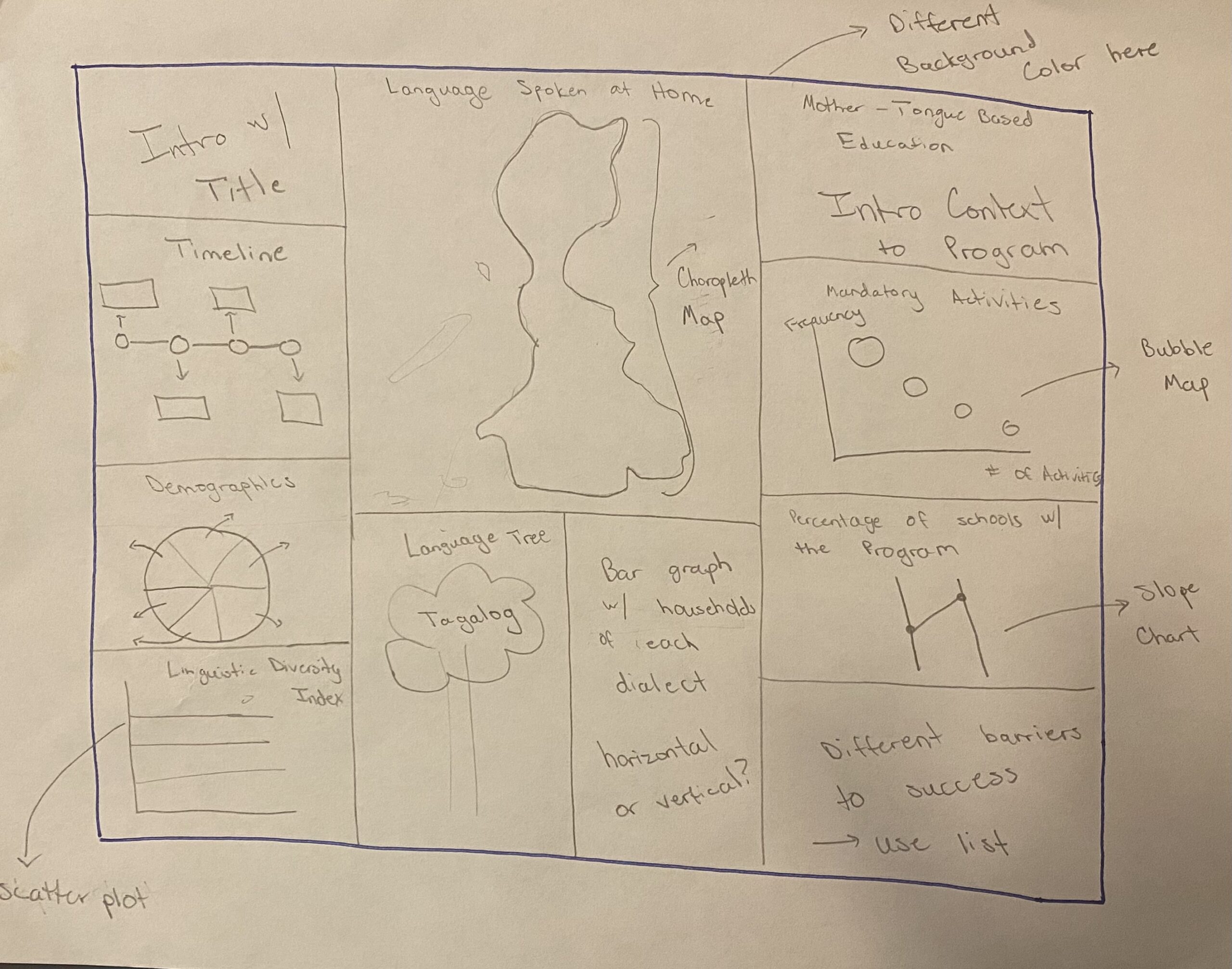
Part 2: Sketching
Then, I decided to start some sketching to get an idea of how my content could fill the page. I also began thinking through some specific graphics that would best symbolize the data I had found. As well as including some stylistic decisions.
Part 3: Working with the Data and Creating Visualizations
When first creating the visualizations, I relied on a four step process for designing for styling considerations that informed by design decisions.

In terms of style, I knew after deciding on my narrative that I wanted to follow a light color scheme and something that would exude the spirit of what I was attempting to convey. Therefore, I settled on utilizing oranges, a light salmon, and yellows. All colors that give off the feelings of warmth. Therefore, much of my time was spent in step 4, refining the original graphs/charts that I exported from Excel or Flourish.
Screenshots of some of the initial graphs/charts before my design modifications

Design Iterations
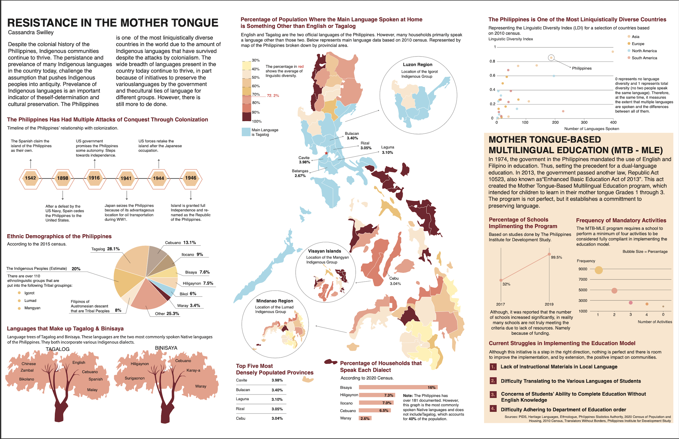
Improvements Based on Critique
I went through about 4 different iterations of this project, while only the first and third are pictured below. My changes focused on rearranging certain graphics and content, as well as, editing the general information. I made changes to ensure design consistency and that the story flowed well.
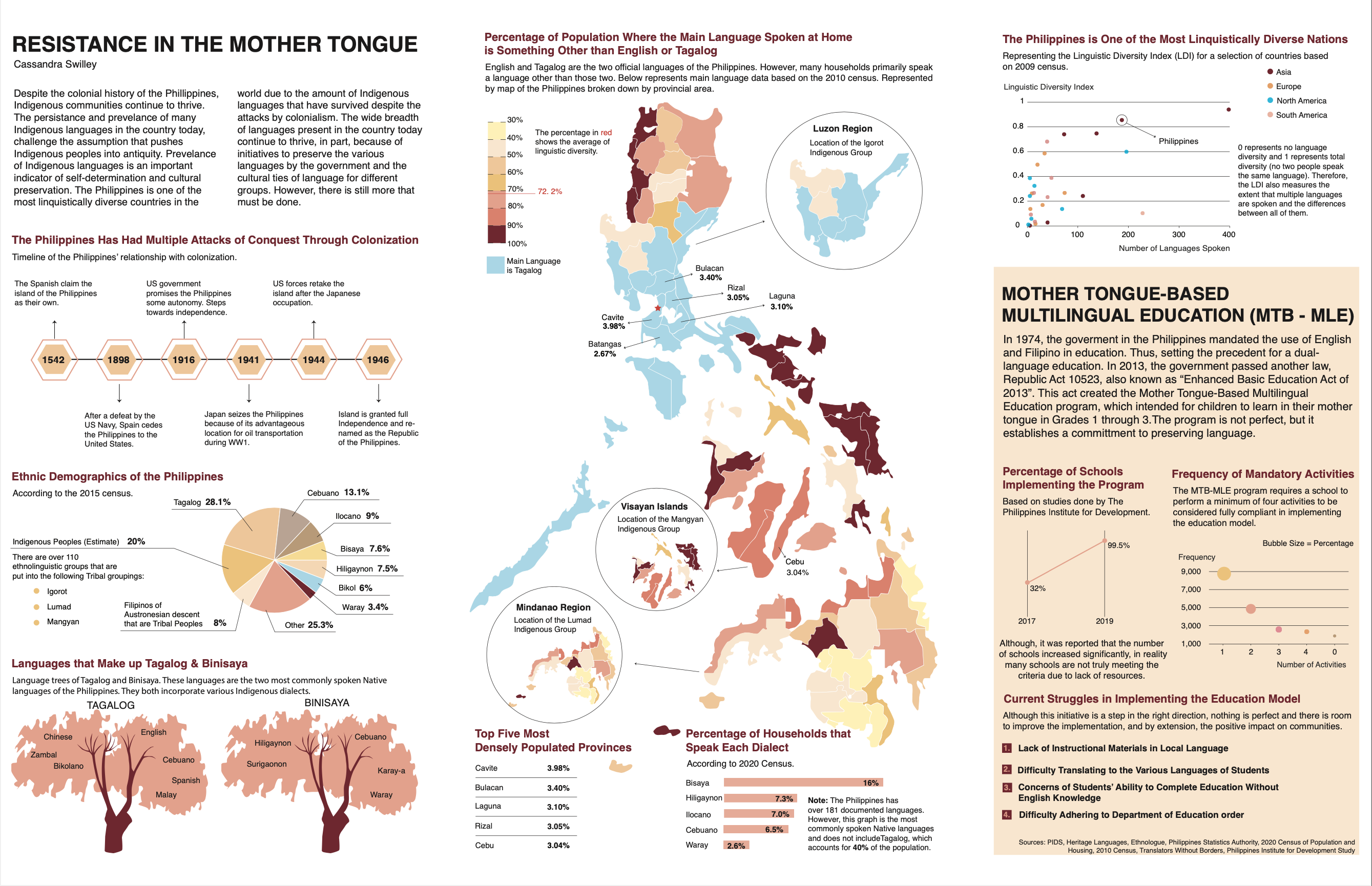
The Final Design
The Final Data Visualization Poster
Leading to the final version, I focused heavily on the organization and creating a visual consistency in terms of spacing and style. It truly was a practice in recognizing opportunities to scale up on certain elements (for example, the map) and scale down other elements (for example, the MTB-MLE section). I was also concerned with ensuring that the story progressed well as readers go from left to right when exploring the data visualization; I wanted it to feel like the narrative was unfolding naturally.
Conclusion
Reflections
Find the story in the data, don't fit the data into a story. As I was going through this process, I was able to learn and find data that I wasn't originally expecting to find. It was through these unexpected findings that the story that I was trying to tell came to light. A significant facet of data visualization is in telling a particular narrative, and as such, there is a certain power/responsibility in controlling the narrative for intended readers. This is why it is important to find the story in the data instead of trying to find data to fit your intended story because if one goes with the latter technique, this can lead to manipulating data and thus, manipulating the narrative.
Margins, Margins, Margins. Throughout my various versions of this infographic, a continued critique that I received was that I needed to give my graphs and charts space to breathe and this could be accomplished by increasing my margins. As a UX Designer, I am aware of the significance of white space and negative space in terms of how a design is perceived and that translated to the arena of data visualization as well. By increasing margins, I was able to give each graph/chart the space it deserved in order to be appreciated and to convey what it needed to convey.
Story/Narrative Progression is Important. Throughout the process of making this graphic, I continually was making edits in order to ensure that the story/narrative was coming together in a way that felt intuitive for readers. In some cases, this required reorganizing the progression of the story with the different charts. It was through this attention to detail that I was able to affirm that progression on the page is also an important aspect of design no matter the platform.

