ErrorSafe
A Nursing Home Error Reporting System
Timeline
March 2023 - May 2023
Role
UX/UI Design, Web Portal Design, Design System, Prototyping
Tools
Figma & Miro
Team Members
Joanna Minott, Mikeiveka Sanon, Nailah Reaves
Introduction
This project was completed as a group final project for a combined grad and undergrad Human-Centered Design course taught at the University of Miami in the Spring 2023 semester. I had a lot of fun working on a team and building out our version of this reporting system with an administrative and employee portal. Two members were undergrads who worked on the employee portal (my pair) and two team members were grad students who worked on the administrative view; both with the same design language.
The Goal
How might we create an incident reporting software that users feel confident and safe using and is a seamless/painless part of a user’s shift?
Problem
Many incidents within nursing homes are underreported despite error reporting procedures being in place.
Through my research, I found that error reporting procedures are often conducted through different online systems and underreported, therefore there was a need to investigate how a better design could help mitigate this problem. Health care practitioners need a platform that fits their specific needs and does not take time away from patients.
Solution
Error reporting system that feels intuitive & easy-to-use.
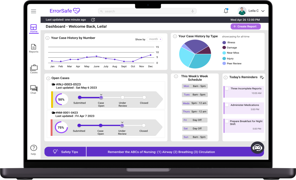
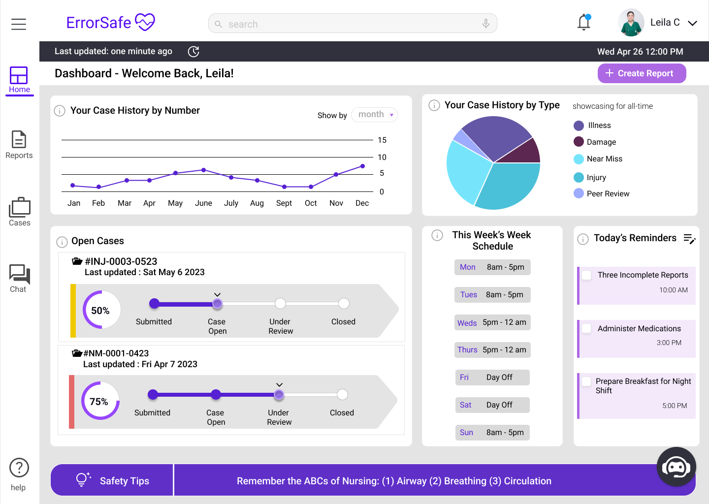
Dashboard Providing Important Information at a Glance
- View personal incident reporting data
- Review progress of open cases
- Quick action to submit new report
- Review safety tips - prevention techniques
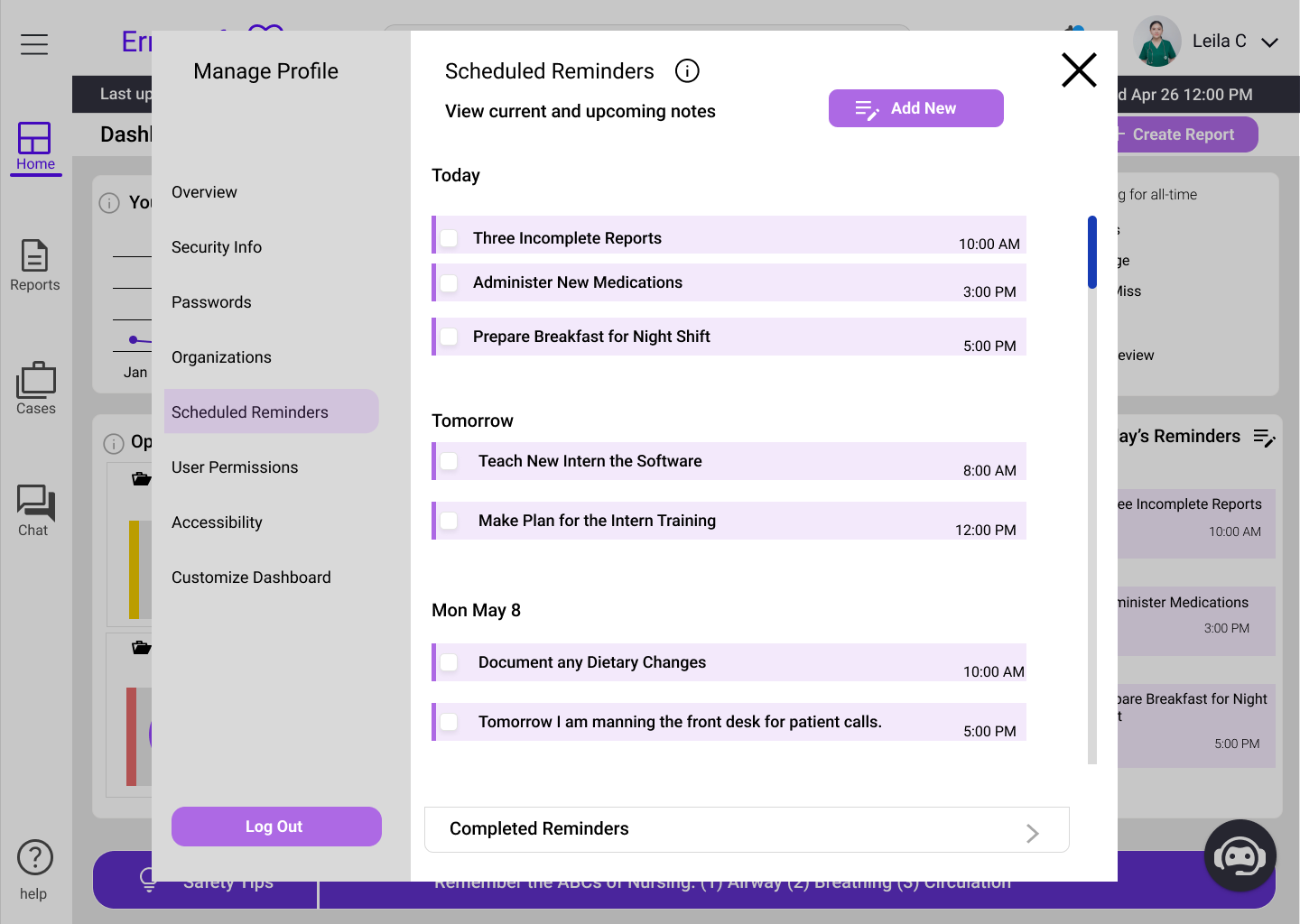
- View set reminders
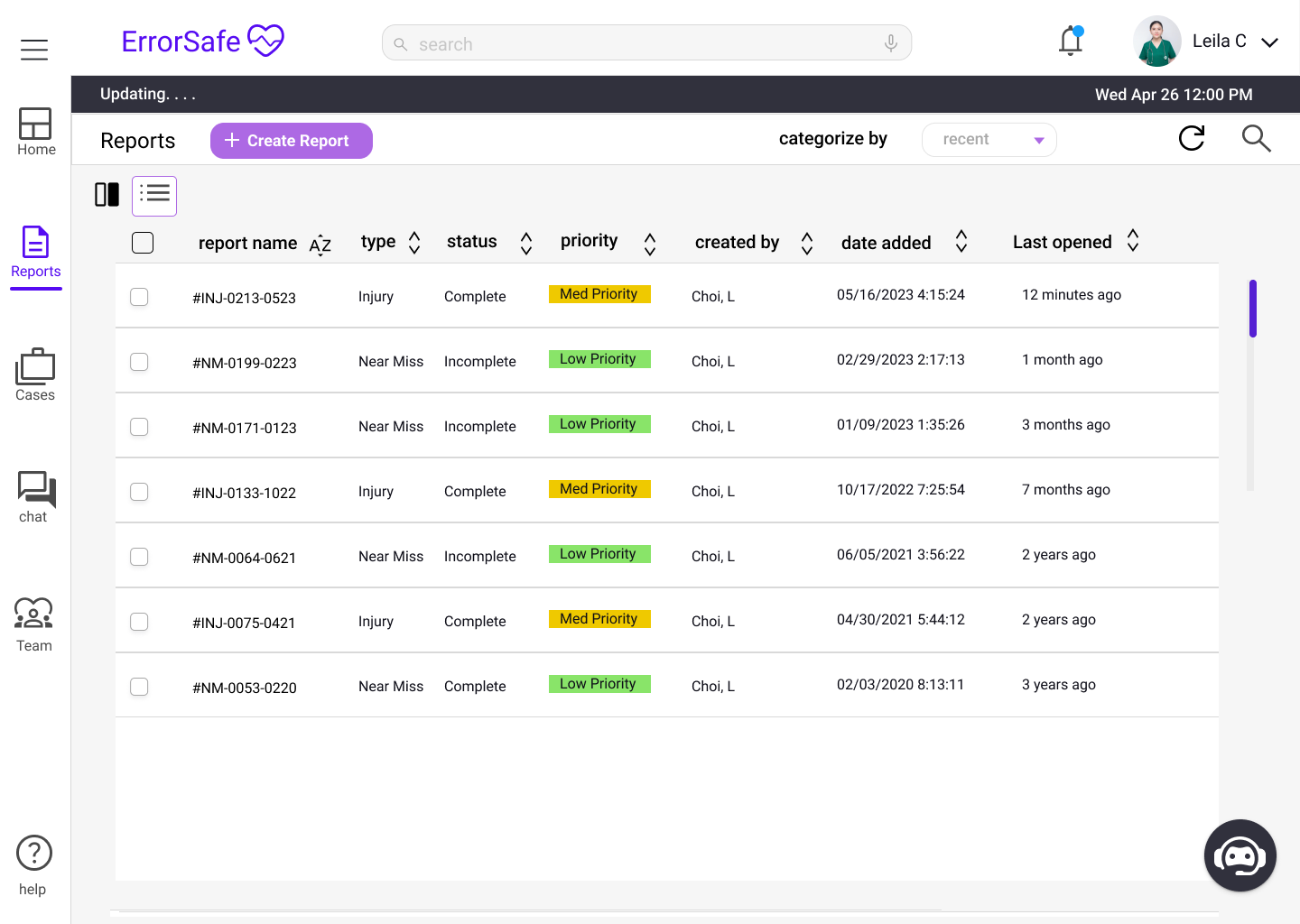
Straightforward Process to Submit Reports and Review Progress of Cases
- Access report repository & Review Submitted Cases
- View Case Status
- Quick and clear form process for reports
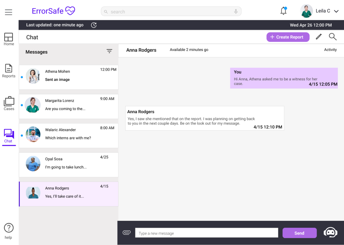
Ability to Chat with Administrators & Coworkers
- Send and receive updates of submitted cases by messaging administrators
- Organize communication between admin and employees
- Limit app fatigue by keeping communication within the same platform
Research
Identifying the Problem Through Secondary Research
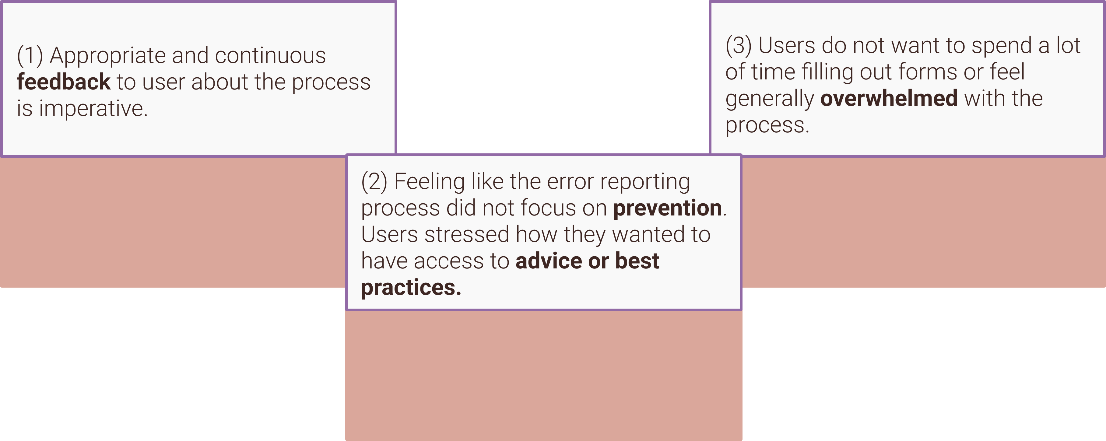
One of my constraints was that I didn’t have time in this project to do my own user research. Fortunately, I was able to conduct secondary research using research databases. In my research, I found that many users find error reporting systems to often be confusing or difficult to use, hard to incorporate into their workflows, and to just generally feel very time consuming.
Secondary Research - Major Insights
Ideation & Design
Step 1: Understanding the Problem - Brainstorming
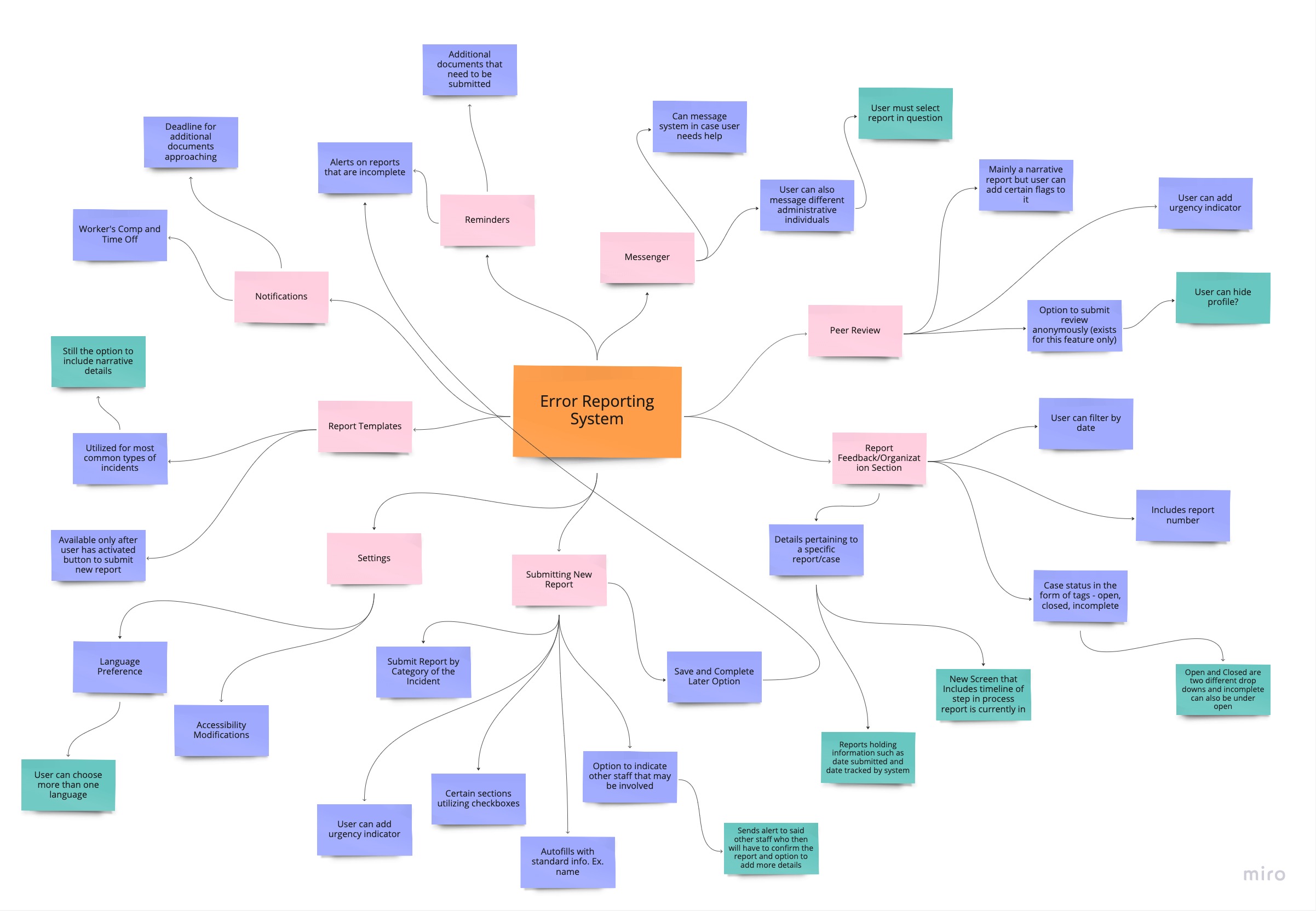
Once, I understood more about my user group and the problem, I went into the ideation phase of my design. This phase was a culmination of many different techniques including concept mapping, site mapping, wireflows, and user personas, utilizing Figjam and Figma. This process allowed me to determine what was needed for the employee portal and align my ideas with my partners ideas as well as the team on the admin side, so we kept a consistent design language both in look and feel.
Wireflows, Concept Map, Site Map
Employee Portal User Persona

Leila Choi | The Fresh, Motivated Nurse
Pain Points:
(1) Not being educated on ways that nurses can improve and prevent certain errors
(2) Keeping track of how many reports/cases she has opened
(3) Not knowing where to get answers to some of her questions with error reporting
Goals & Motivations:
(1) Learn Preventative Steps
(2) Be able to submit reports in a timely manner
(3) Be updated/aware of the progress of her cases
(4) Become an overall better nurse
Step 2: Sketching
For my rough sketches, I primarily explored alternative designs for the dashboard (one of my main responsibilities). I attempted to get many ideas out in a short amount of time in order to further iterate on the versions that I liked best. I like to do rough annotations as I sketch because I like to at least begin to think about different micro-interactions and the various interactive elements as I sketch.
Design Iterations
Improvements Based on Critiques
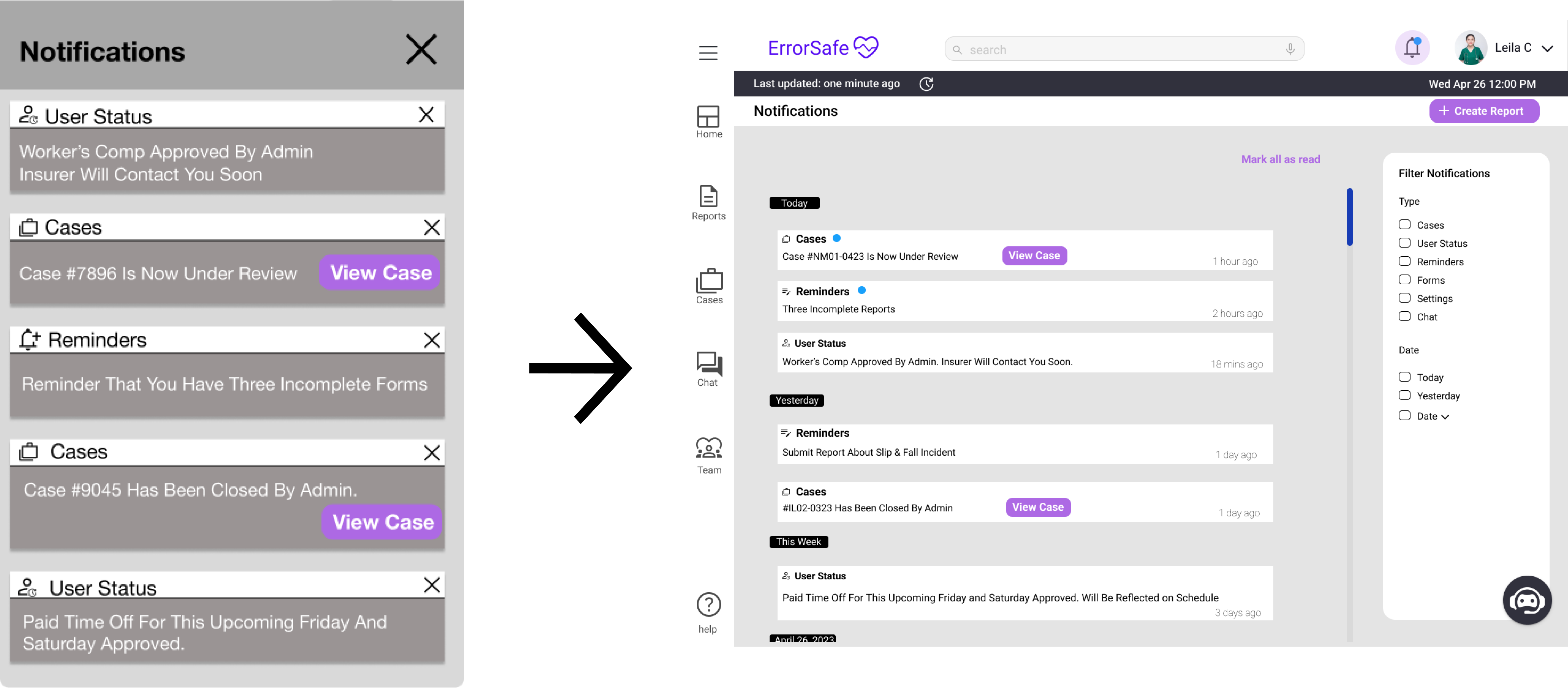
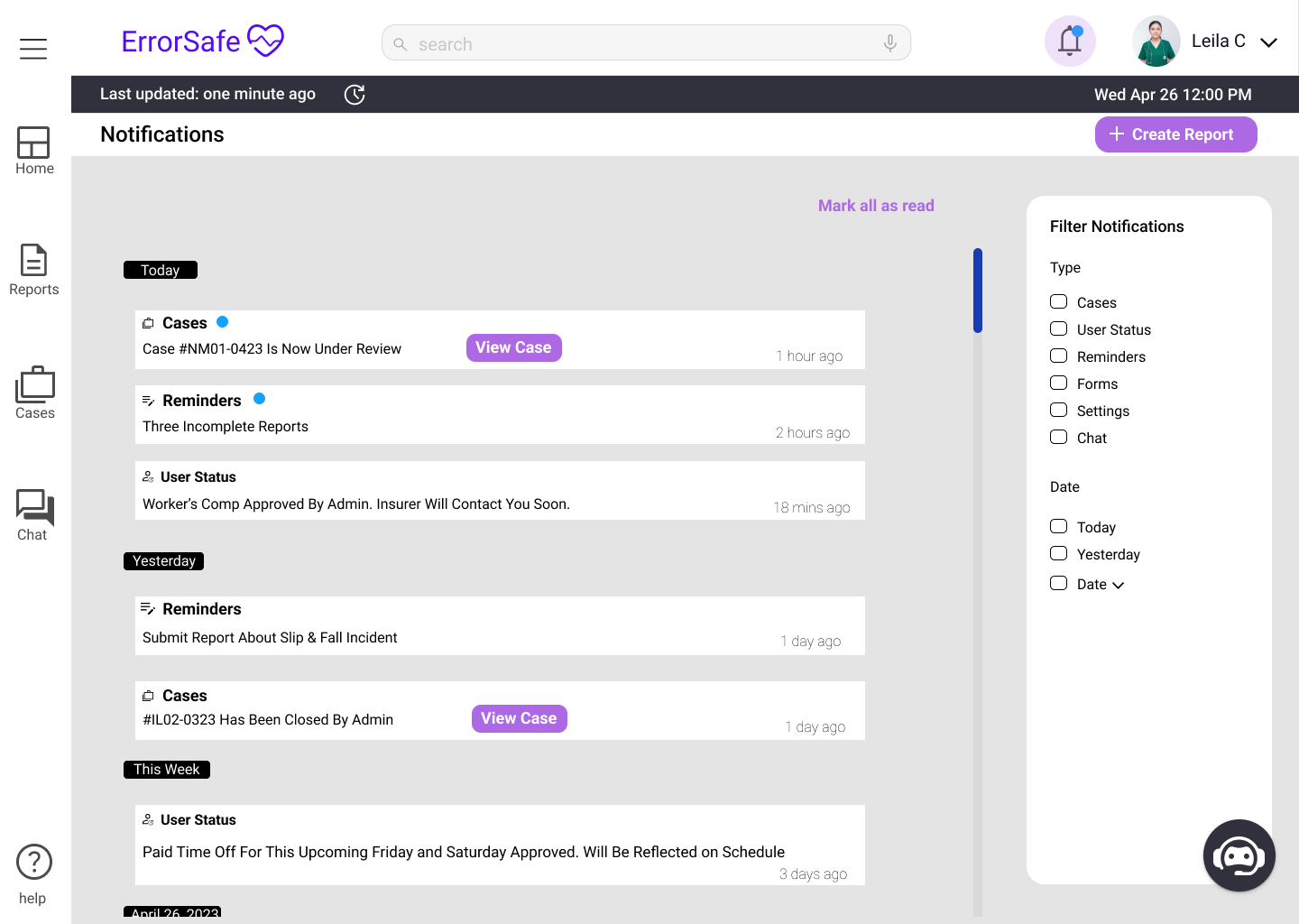
01 Notifications Screen - Insights & Improvements
(1) Some feedback concerns were about scalability of a modal, so I changed Notifications to be a separate screen
(2) Instead of each notification having a visible “x”, I decided to make the “x” appear on hover
(3) Added grouping method and filter capabilities
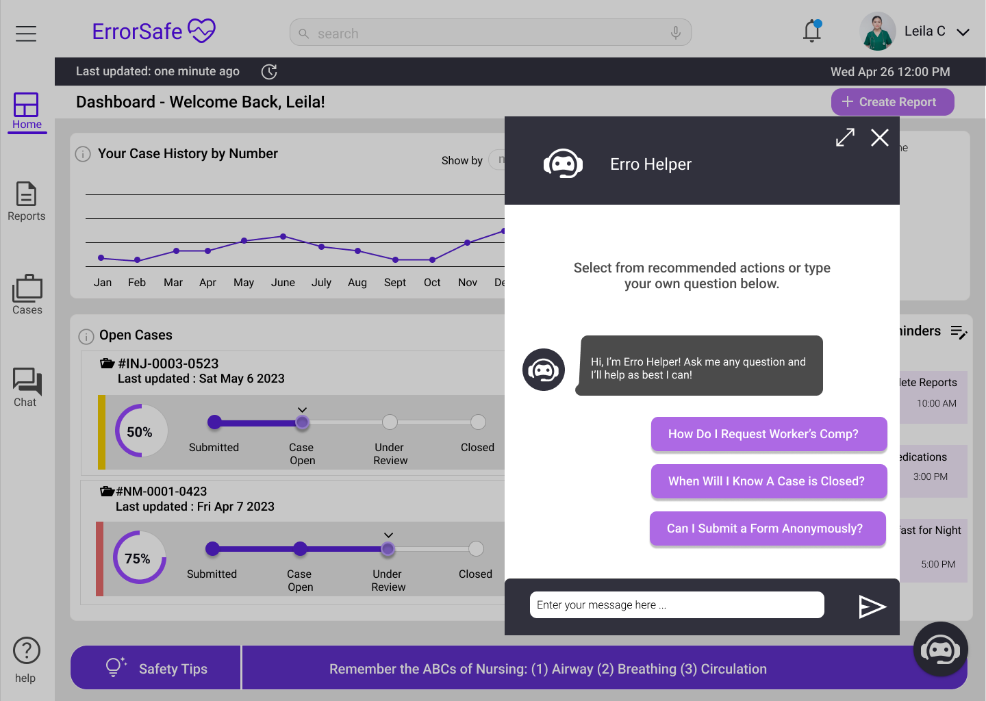
02 Refining Dashboard Design - Insights & Improvements
(1) Developed new progress bar: view information at a glance and are an overall more professional/sleek design.
(2) Rearranged the widgets to increase the white space throughout and the visual sophistication of the design
(3) Moved chatbot to the bottom right corner in order to free up more space on the navigation and create an interaction that felt more intuitive
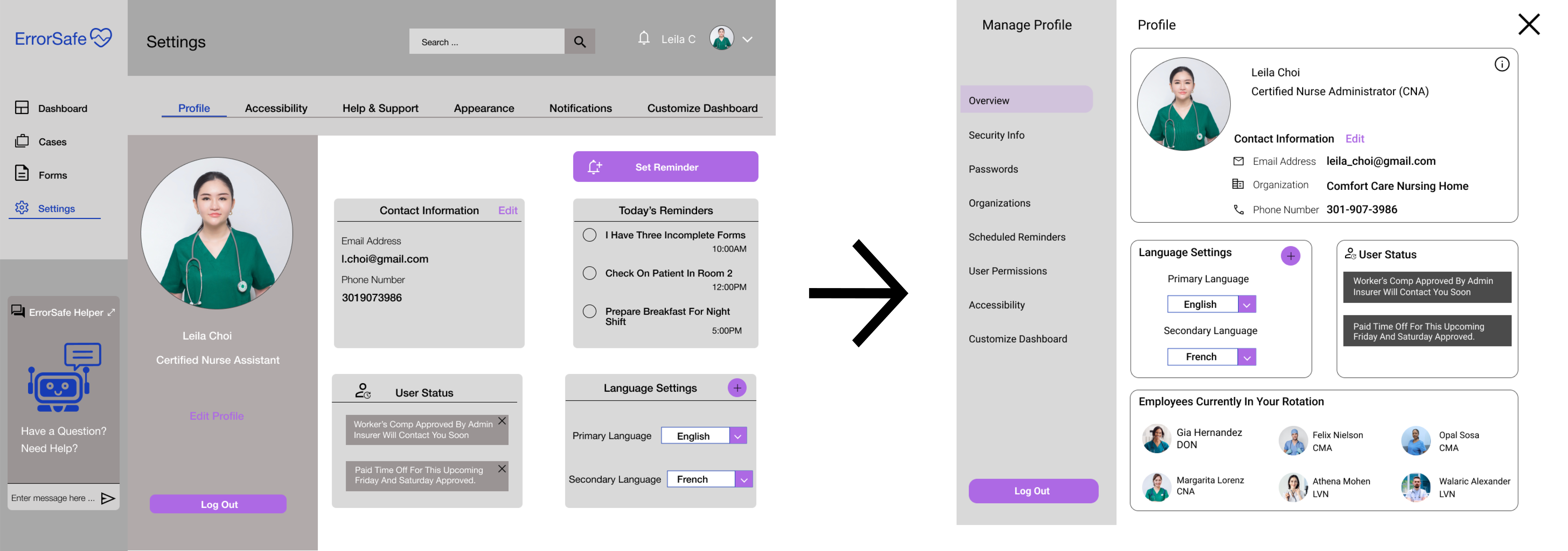
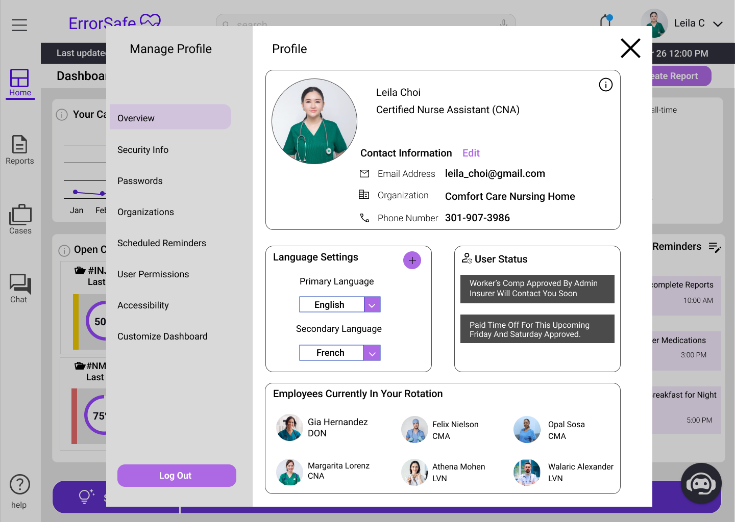
03 Settings/Profile Screen - Insights & Improvements
(1) Redesign of the visual hierarchy and layout in order to refine the design and create something that is more intuitive.
(2) Considered moving certain elements to different screens. Ex. Reminders moved to dashboard
(3) Added the “in your rotation” section to provide some more context/information that would be useful to our user group.
The Final Screens & Protoype


Conclusion & Reflection
What I Learned and Areas Where I've Been Able to Grow
Importance of Conversation. Since I was in a group of 4 people for this project, we had many meetings to continue to check in with each other's designs and ensure that we were utilizing consistent design language. I found it very important that we were meeting to go through features and ideas to formulate a clear idea of how we could meet the goals of our users.
Designing Dashboards. This was a new challenge for me as I have not had the opportunity to design a dashboard before. I went through many iterations of my dashboard in order to get closer to something that (1) didn’t overwhelm users but (2) still showcased the information they should be able to comprehend on first glance.
Designing Progress Indicators. I also took on the responsibility of designing the progress bars for the portal view. After doing some research into design precedents, I realized that I had the opportunity to do something more creative. The design of this progress indicator also proved to be iterative as I designed different versions of it showcasing different steps, different shapes of the progress bar, and providing different metadata.
If I had More Time... I think an important aspect missing from this project that I was not able to do user testing, which is something I would like to add if I had more time. I also think I would revisit the dashboard design to continue refining and potentially incorporating more white space.


